


The comeback of muted colour schemes has become a major trend in the dynamic industry of interior design. With the return, it invites a new, vintage, and calming styling. And yet one of the most striking trends to observe in such revival is how many designers have used a palette of natural and neutral tones; like shades of brown and beige for instance. In this blog, you will see how to create the perfect earthy tones for your home by considering the choices of the walls, along with the colour of laminates, all the way to decor and light fixtures.
The Comeback of Muted Colour Schemes
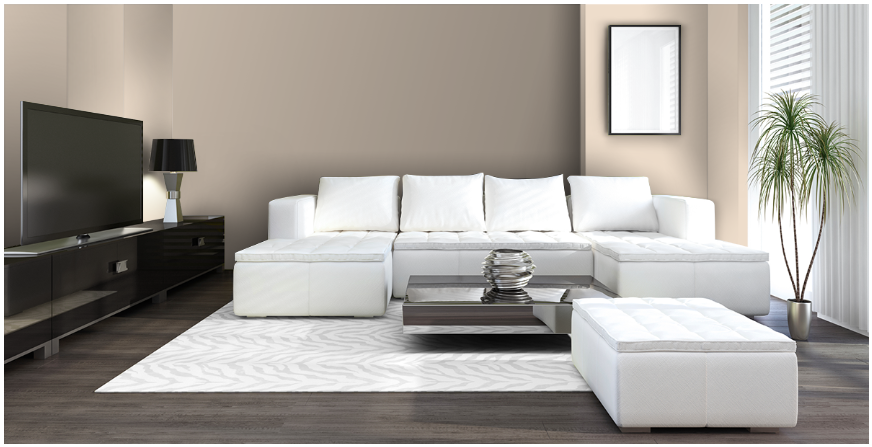
The comeback of muted colour schemes adds to the enduring charm of the elegance of your room. Lately, owners are increasingly attracted towards the tranquillity that soft tones bring with them. When you use a muted colour palette, you welcome several design possibilities, which further bring a sophisticated look throughout your living space. For example, the Icicle White shade (Code: 4P1841) from Berger Paints brings a lot of elegance to your room along with a variety of furniture options that you could choose from because its muted colour tone suits a vivid range of colours.

Source: Berger Paints
Shades of Brown and Beige on Your Walls
Shades of brown and beige make a great backdrop for the styling of your home interior. Not only do these tones represent coziness, but they also make a perfect background for the furniture pieces. The quiet tone from these colours promotes serenity, leaving the van ready to receive more natural elements.
Soft hues of taupe, mocha, and creamy beige can give a whole new dimension to your home. For instance, you could check the Lotus Seed (Colour code: 4936) from the beige palette of Nerolac Paints as shown below. The beige palette comes with a benefit that allows you to keep light as well as dark furniture depending on your choice.
Source: Nerolac Paints
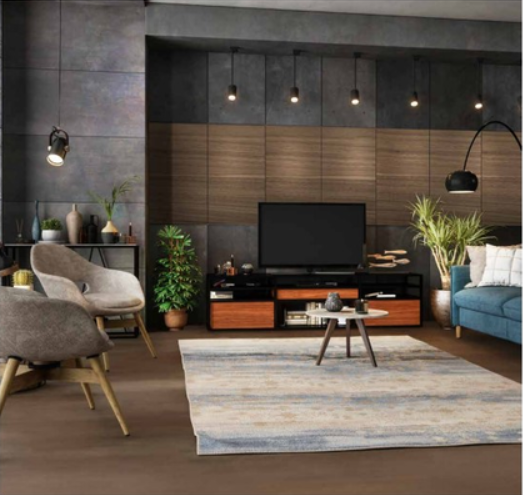
Similarly, incorporating an accent wall that is a darker shade of brown to add depth and visual effect to the room is a good example to consider. It not only serves as an accent but also adds beauty to the structure and sets it apart from others.
For a brown accent wall, you could take into consideration Asian Paints’ Lavang-N shade from its Brown palette. This would help in maintaining a perfect balance of muted tones in your living area.

Source: Asian Paints
Laminates and Veneers in Earthy Tones
With the comeback of muted colour schemes, the natural and neutral tones of your walls can be matched with laminates or decorative veneers in muted tones.
Century Laminates, for instance, provides an array of laminates and veneers. For a beige colour palette, you can try the its Lucida Woodgrains palette as shown below. The imitating wood patterns in Zebra Wood (787 LU) and Natural Olive (788 LU) layers for your cabinets, shelves, and tables. Thus not only do you visually bracket in your design but also introduce a touch element to the whole of the room which is comfortable.
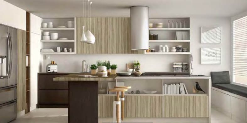
Source: Century Laminates
The “Wood” appearance of veneers, as shown below from Century Laminates’ Kering Matne Veneer Collection, enables them to cover large surfaces like doors and panels. By this decision, you not only enliven your living space aesthetically but also add a trace of nature inside your home which further deepens your connection with the outside world.
Source: Century Laminates
Lighting Fixtures Made of Bamboo and Terracotta
The lighting fixtures of the space can shape the ambience even more. Aiming for a natural and neutral look, yours can be achieved with lighting fixtures materialized from terracotta. Such materials come not only in the colours of minimal design but also in a slight texture and visual emphasis.
To consider an example, you could check the Gloss Terracotta lights by Tranceterra as shown below. This kind of light fixture looks simple yet elegant and suits any kind of wall colour and furniture laminates, and gives a feeling of luxury at the same time.
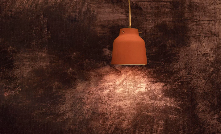
Source: Tranceterra
Another option is using bamboo pendant lights by Habere India that also can act as stunning focal points at the same time, creating a welcoming ambience with an appealing and pleasing glow. The earthen colours of these fixtures perfectly harmonize with the overall design, thereby forming a salient tranquil ambience.
Source: Habere India
Overall, using natural and neutral colours in your home design ensures a perfect combination of timeless and comfortable atmosphere. The resurgence of neutral colour palettes, specifically shades of brown and beige, is nowadays a fantastic way to create a living space where you can incorporate some warmth, depth, and comfort in every area of the home. Natural materials such as wood, which can be accentuated by tone-on-tone laminates and veneers, and by incorporating lighting fixtures made of bamboo and terracotta highlight this sense of nature. Wrap your home in garments of serenity, where the soft tints say a lot about the evanescence and refinement featured in your space.

3 Responses
Test
test reply
Hello